The Chicago Blackhawks jersey history spans nearly a century of hockey tradition, from simple wool sweaters in 1926 to today’s high-tech performance uniforms. These iconic jerseys tell the story of one of the NHL’s original franchises, featuring evolving designs that reflect changing eras while maintaining the team’s distinctive identity. Understanding how these uniforms transformed across championship eras, special events, and technological revolutions reveals both the sport’s evolution and Chicago’s deep hockey heritage.
The Birth of a Chicago Icon: Early Blackhawks Jerseys (1926-1940)
From Black and White to Team Colors (1926-1935)
When the Chicago Blackhawks took the ice for their inaugural 1926-27 season, their jerseys featured a straightforward black and white color scheme. These early uniforms reflected the practical constraints of 1920s hockey, using heavy wool that absorbed moisture and weighed players down as games wore on.
The team flipped its color scheme the following season, switching to black home jerseys and white road uniforms. This change established a pattern that would define the franchise for decades to come.
Everything shifted in 1935 when the organization added color to both the logo and jerseys. Red became part of the team’s identity, transforming the visual impact and making the uniforms more vibrant and distinctive among NHL teams.
The Iconic Barberpole Design (1937-1940)
The 1937 season brought the introduction of the multi-stripe barberpole jersey. These striking horizontal stripes wrapped around the torso, creating a pattern that would become synonymous with vintage Blackhawks aesthetics. The barberpole design represented bold creativity during an era when most teams stuck with simpler looks.
By 1940, the foundation for Chicago’s classic jersey style was firmly in place. These early experiments with color, pattern, and branding created design elements that resonate through generations of hockey fans.
The Golden Age: Classic Designs Take Shape (1940-1965)
Jersey Refinements and the Indian Head Patch (1940-1948)
The 1940s marked a refinement period for Chicago Blackhawks jerseys. The team added a white jersey to its rotation during the 1940-41 season, expanding uniform options. Between 1941 and 1944, the barberpole crest went through modifications while the white jersey gained an Indian head patch that would become central to the team’s visual identity.
The 1947-48 season saw significant changes to the black crest and white stripe patterns. The team removed the patch from the white jersey, streamlining the design toward what collectors now recognize as classic throwbacks from this golden era.
Establishing the Core Pattern (1955-1958)
During the 1955-56 season, the Blackhawks established the core pattern that would define both home and away jerseys for years. This consistency helped build brand recognition as television broadcasting expanded hockey’s reach. The design balanced tradition with modern appeal, featuring the prominent Indian head logo across the chest.
Sleeve numbers appeared for the first time in 1957-58, responding to both fan demand and league standards for player identification. This practical addition enhanced the overall look while serving a functional purpose.
Throughout this golden age, the jerseys maintained their distinctive character. The combination of red, black, and white created instant recognition, whether fans watched from arena seats or increasingly popular television broadcasts.
The Modern Era Emerges (1965-1996)
Maintaining Classic Design (1965-1981)
As hockey entered the modern era, Chicago Blackhawks jersey designs evolved more gradually. The core elements stayed intact while subtle adjustments reflected changing times. Between 1965 and 1981, the team maintained its established look, allowing the classic pattern to define the franchise.
League requirements in 1977 mandated nameplates on jersey backs, fundamentally changing how uniforms displayed player identity. This addition reflected the sport’s growing commercialization and fan desire to connect with individual players.
Bolder Stripes and Design Details (1981-1996)
The 1981 season brought a notable shift when the Blackhawks widened the stripe pattern on both jerseys. This adjustment gave the uniforms a bolder appearance that matched the physical, high-energy style of 1980s hockey. The wider stripes remained consistent through 1996, creating a distinct 15-year period recognizable to fans.
The shoulder “C” with crossed tomahawks migrated from its elbow position during this era. Featuring chain-stitching detail, this secondary logo element added visual interest to the upper jersey, demonstrating the franchise’s commitment to quality uniform production.
A special moment arrived during the 1991-92 season when the team commemorated its 75th anniversary with an uneven barberpole design. This commemorative variation paid homage to the 1937 original while celebrating the franchise’s longevity, bridging past and present.
Championship Dynasty and Contemporary Designs (1996-Present)
The Blackhawks entered a new design chapter in 1996 that would eventually coincide with unprecedented championship success. This period saw technological innovations transform jersey construction while maintaining connections to the team’s rich visual heritage.
The Black Alternate and Reebok Edge Revolution (1996-2007)
The 1996-97 season introduced a larger crest that made the primary logo more prominent, reflecting modern design trends favoring bold, easily recognizable branding. The same season also marked the debut of the black alternate jersey, which became a fan favorite through 2009.
The all-black jerseys worn by stars like Tony Amonte and Chris Chelios symbolized the team’s grit and intensity. These alternates built a devoted following during their 13-season run before retirement.
When the NHL adopted the Reebok Edge system in 2007-08, uniform construction changed dramatically. The new performance jerseys featured moisture-wicking fabrics, tailored fits, and lighter materials that improved player mobility while maintaining traditional design elements fans cherished.
Championship Era Through Adidas Transition (2007-Present)
The Blackhawks’ championship run beginning in 2010 elevated interest in every aspect of the team, including jersey designs. The franchise won Stanley Cups in 2010, 2013, and 2015, creating massive demand for authentic and replica jerseys.
When Adidas took over NHL uniform production, they brought renewed focus on sustainability and advanced textiles. The transition maintained core design elements while introducing subtle improvements in fit and durability, ensuring the iconic look stayed recognizable while embracing contemporary manufacturing techniques.
The championship dynasty solidified the jerseys’ status as symbols of excellence. Fans wearing these uniforms connect with the team’s recent success while honoring decades of hockey tradition in Chicago.
Special Event and Alternate Uniforms
Special event jerseys have become key components of the Blackhawks’ visual identity, offering creative expressions that celebrate unique occasions while engaging fans through limited-edition designs.
Winter Classic Jerseys
The 2009 Winter Classic jersey paid homage to the 1935-37 era when color was first added to team uniforms. This design featured vintage-inspired details that resonated with longtime fans while introducing younger audiences to the franchise’s design heritage.
The 2015 Winter Classic offered a different historical reference, echoing the simple 1957 white design when the core pattern was established and sleeve numbers were added. This cleaner look contrasted with the elaborate barberpole patterns, showing the franchise’s diverse design history.
Both Winter Classic appearances allowed the Blackhawks to celebrate their past while competing in contemporary hockey’s most anticipated regular-season events. These special jerseys became instant collectibles, bridging generational gaps among fans.
Stadium Series and Reverse Retro Collections
The 2014 Stadium Series introduced a chrome crest that applied modern material treatments to the traditional logo. This bold approach created visual impact under special lighting conditions while maintaining brand recognition.
Stadium Series and Reverse Retro collections have explored different color combinations and pattern interpretations. These limited releases generate excitement while diversifying merchandise offerings. The Reverse Retro initiative particularly resonates with collectors by reimagining vintage designs through contemporary lenses.
Chicago Blackhawks Logo Evolution Through the Decades
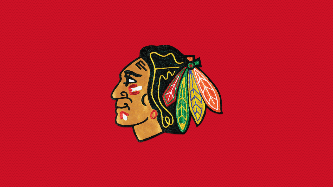
The Chicago Blackhawks logo evolution reflects careful brand management across changing cultural contexts. The primary Indian head logo has maintained core elements since 1935 while undergoing subtle refinements in detail and proportion. Each iteration preserves the design’s essential character while adapting to contemporary expectations.
The organization has consistently honored the logo’s origins (named after the 86th Infantry Division that founder Frederic McLaughlin commanded) while presenting it with appropriate respect and historical context.
Secondary logos, including the shoulder “C” with crossed tomahawks, have complemented the primary mark. These supporting elements provide variety across different jersey applications while reinforcing brand cohesion, helping build one of sports’ most recognizable visual identities.
Complete Chicago Blackhawks Jersey Timeline
| Era/Season | Key Jersey Changes |
| 1926-27 | White and black jerseys debut |
| 1927-28 | Colors reversed to black and white |
| 1935 | Color added to logo and jersey |
| 1937 | Multi-stripe barberpole jersey |
| 1940-41 | White jersey added |
| 1941-44 | Barberpole crest changes; white jersey gets Indian head patch |
| 1947-48 | Black crest changes; white stripes update, patch removed |
| 1955-56 | Core pattern set for both jerseys |
| 1957-58 | Sleeve numbers added |
| 1981-96 | Stripes widen |
| 1991-92 | 75th Anniversary uneven barberpole |
| 1996-97 | Larger crest; black alternate debuts |
| 2007-08 | Reebok Edge system adopted |
| 2009-11 | Winter Classic design (homage to 1935-37) |
| 2014 | Stadium Series chrome crest |
| 2015 | Winter Classic echoing 1957 white |
Experience Chicago’s Hockey Heritage
Chicago’s hockey heritage extends beyond the United Center ice, weaving through the city’s neighborhoods and gathering places. Exploring this rich tradition means experiencing the passion that makes Chicago one of hockey’s greatest cities.
Before or after catching a Blackhawks game, visit Pequod’s Pizza to taste Chicago’s other famous creation. This historic restaurant specializes in deep-dish pizza with a signature caramelized cheese crust that’s earned recognition as Yelp’s #1 pizza in the country.
Just as the Blackhawks’ jersey designs have evolved while maintaining their distinctive identity, Pequod’s has perfected its craft since 1971 while staying true to what makes Chicago pizza special. It’s the perfect way to complete your Chicago hockey experience, combining two of the city’s most beloved traditions in one memorable visit.
Image courtesy of NHL